Wednesday, September 29, 2010

Self-Portrait Brick Wall


As you can see. I messed up a little... =(

I created a new layer and made it white. Then I Put that layer under the copy. So I added another layer, and put the brick background in. I then put a layer mask onto the copied picture. then "destroyed" the green-screen by using the brush tool after pressing "x". I then used the clone tool to even things out. but that obviously didn't work out well. I had fun though! =D

Monday, September 27, 2010

Landscape


Original


Revised


I used the clone tool. It was very hard, but fun. =)

Wednesday, September 8, 2010

Principles of Design


Balance: The balance is good. It looks like a straight-angled photo. The main focus is on the lake/river, so even though the trees are lopsided, they're okay.

Proportion: The lake/river looks relatively smaller than most... But maybe that's supposed to be like that. If the photographer is trying to emphasize the lake/river, he's doing pretty good. If he or she is trying to emphasize the little house - or boat house - in the background, they're doing a pretty bad job with that.

Rhythm: The photo looks like it would be in the category of "Flowing Rhythm". The lake/river  looks like it could be moving, but it also has a serene habitat-ish look. It looks like something is moving in the background, but you don't notice that right off-the-bat.

Emphasis: The photographer is using variations of green, in which they are using "Contrast of Color". They are also emphasizing the size of the lake/river.

Unity: If the picture wasn't so bright I would like it more. But the consistency of color is good. They kept using the green and blues and used that as an advantage.

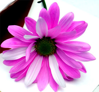
Flower

This was the original picture to Adobe Photoshop. I found it on the PAA digital art blog. I like the fact that there are many things to choose from in the photo. I can choose the rings, flower and the envelope. I like that the envelope's inside is red, so that catches my eye also. So do the rings on the white background and the bright pink/white flower.


I photoshopped it and this was the result. I wish I had cropped in the rings too, but I decided to focus on the flower instead. I like how I made the white petals sort of stand out more, and the inside part of it was darker to become more in the background. I made the darker colors not insanely dark and the lighter colors more vibrant and bright. The petal detail is still showed, even though I did make the white almost impossible to differentiate between the envelope and the white petal. I tried to make the flower as eye-catching as I saw I could do without making the petals insanely dark.

Tuesday, September 7, 2010

Photshop videos

The first video was the most helpful, I think. It explained a lot of what I needed to know. (shortcuts, coloring, etc.) I didn't see anything about like touching up hair and someones face. If the videos had that, I would've been a little bit more helpful. It's quite simple and to the point, which made it easier to understand. I also learned how to put writing in my pictures.

The second one was like the first one. Simple and easy to listen to. It also was really explanatory about zooming in and out. And then the thing with the dandelion puff was cool. I got to learn about selective stuffs.

The most helpful was the first one. It explained a lot more, but for just the basics the second was the best.

Wednesday, September 1, 2010

1 Interest

I'm into writing. I sort of want to be an author. I think it would be fun, but it might be overwhelming, too. I've been trying to write a book for some time with my friend Holly, but she now lives elsewhere.

I want to be a Social Worker. Like someone who helps people that were a victim of crime. It would be life changing if that was my career.

I've always liked music. I want to play the Ukelele (now known as "Uke"). I've gone to about 4 concerts, but my favorite, still, is the one with Starfield. I highly recommend it. As Ferris Bueler says, "It's so choice." =D